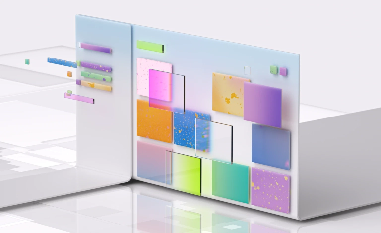
Layout
Fluent’s layout system defines how our apps use space to create relationships between components, highlight what’s most important, and help people make decisions comfortably on any screen.
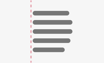
Spacing and proximity
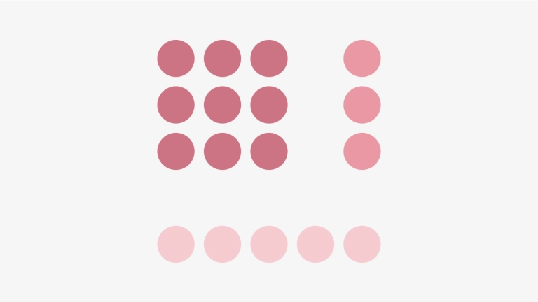
Elements in a design that are in close proximity are seen as being meaningfully related. As more space is added between elements, their perceived relationship weakens. Elements arranged in the same spacing pattern are seen as related pieces that have equal weight and implied connection.
Space is used to denote groups of associated information. Used correctly, spacing creates logical sections of content on a page without having to use lines or other graphical elements as a divider.
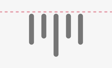
Creating hierarchy with empty space
UI elements that have more spacing around them draw more focus and tend to be perceived as higher in importance than elements that have less space around them. In fact, UI elements that are set close to each other might be overlooked. People may notice the grouping but not process each individual item.
Too much dense information can also be disorienting and overwhelming. White space lets the eye rest and lets people process information. Use spacing to create a roomy visual rhythm and areas of focus.
Global spacing ramp
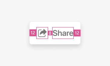
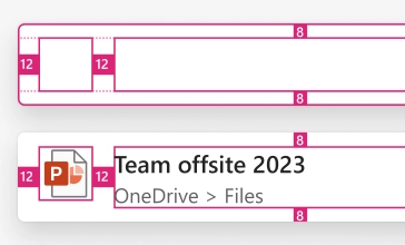
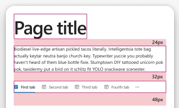
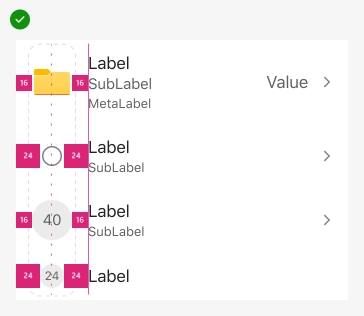
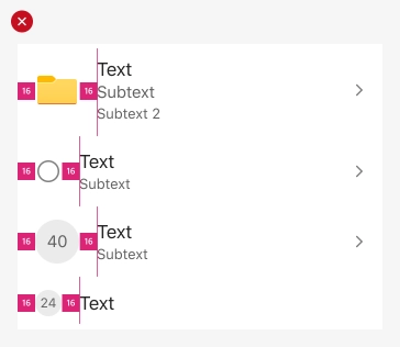
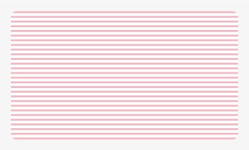
Fluent’s global spacing ramp is designed to help makers get the best use out of consistent spacing while staying flexible to meet each experience’s needs. The base unit is four pixels which allows a scale of supported sizes. A 4x system reduces confusion while being easy to implement.
The global spacing ramp is multi-platform. It’s used in every component and layout to create a familiar and cohesive product experience, regardless of device or environment. Values in the ramp abide by the native platform scaling and pixel density. In iOS, values are measured in points (PT), in Android, density-independent pixels (DP), and in Web React, pixels (PX).
To create consistency, the ramp includes values that fall outside of the four pixel units. The values 2, 6, and 10 account for extra padding in the Fluent icons and help to align the icons to the four pixel grid. Space is measured from an element’s bounding box.
| Token | Value | |
|---|---|---|
| sizeNone | 0 | |
| size20 | 2 | |
| size40 | 4 | |
| size60 | 6 | |
| size80 | 8 | |
| size100 | 10 | |
| size120 | 12 | |
| size160 | 16 | |
| size200 | 20 | |
| size240 | 24 | |
| size280 | 28 | |
| size320 | 32 | |
| size360 | 36 | |
| size400 | 40 | |
| size480 | 48 | |
| size520 | 52 | |
| size560 | 56 |
Applying Fluent spacing
The global spacing ramp is easily applied to designs across a wide set of needs. Here are some examples of how Fluent spacing is applied throughout Fluent components and layouts.
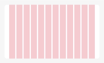
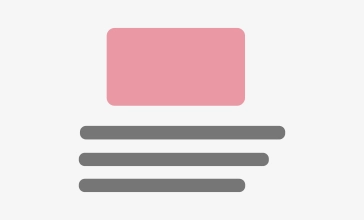
Component spacing
Within components, smaller spacers are used to ensure a strong implied relationship between each element while also guaranteeing they are perceivable and distinct.
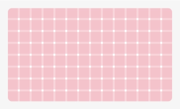
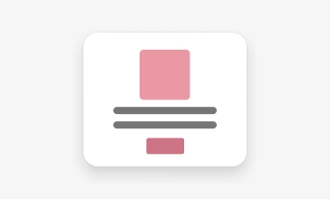
Pattern Spacing
Consistent spacing in patterns is crucial to creating familiar visual rhythm and design cohesion across products so people can jump in quickly and easily.
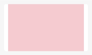
Layout spacing
Use space in layouts to direct the eye to areas of high importance and guide people to what they’ll need to see next.
Responsive spacing
In responsive scenarios, consider changing the spacing within components, patterns, and layouts to fit the scale of various devices.
Remember that the ramp is flexible to accommodate your needs. It’s important to use spacers as a tool for creating consistency, rather than blindly using consistent spacers. For example, when creating lists, adjust spacers to left align text and center align icons. Spacers will also help provide enough room to accommodate minimum touch targets on mobile devices, iOS & Web [44 x 44], Android [48 x 48].
Adjust spacers for consistent visual rhythm
Don’t use the same spacers if it breaks a pattern
Grid
The grid provides the fundamental groundwork for placing visual elements. Working on the grid ensures a standard direction for creative decision-making across products and a responsive framework for design on different devices. It makes an app look coherent, enhances visual hierarchy, and balances design.
There is no one-size-fits-all grid behavior. Different content types can render better when using fixed, stretch, or hybrid grid models. Use the following guidance to decide on the best approach for your application.
Grid anatomy
All grids are made up of three elements: columns, gutters, and margins.
Columns
Columns are the building blocks of a grid and mark where elements should be placed. A 12 column framework is common for its flexibility and easy division. It’s highly composite for layouts and can update responsively based on screen size.
Gutters
Gutters are the negative space between columns and their width should be a multiple of the base unit. To better adapt to a given screen size, gutter widths can change at different breakpoints.
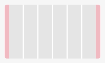
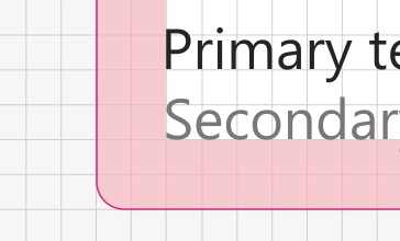
Margins
Margins are the space outside of the grid columns and rows. Margin widths can be fixed or percentage-based and can change at different breakpoints.
Regions
Regions are groupings of columns, rows, or modules that form an element of a composition. The most important elements and pieces of content take up the biggest pieces of the grid.
Grid types
There are many ways to combine columns, gutters, and margins to create different grid layouts. Consistency is key to building familiar patterns that make your app easy to scan and navigate. A good grid will also adapt to different screen sizes and orientations, ensuring cohesion across environments.
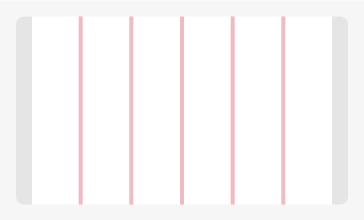
Baseline grid
Baseline grids consist of dense horizontal rows that provide alignment and spacing guidelines for text. Aligning baselines to a specific absolute grid establishes a vertical rhythm — a pattern that’s easier for the human brain to scan. Baseline grids are especially useful with content that spans multiple columns.
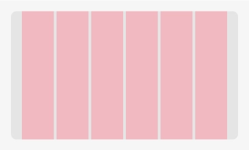
Column grid
Column grids are the most common layout used for web applications. The grid splits the frame into evenly spaced vertical fields which objects are aligned to. These grids are typically made of 12 columns which can then be divided into halves, thirds, fourths, and sixths, when designing responsive screen sizes.
Manuscript grid
Manuscript grids have a primary structure defined by large continuous blocks of text surrounded by margins. Think of them as single column grids. This style helps to ensure readability by consolidating content to provide the optimal line length.
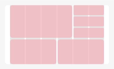
Modular grid
This is a variation of the column grid. Modular grids have both vertical columns and horizontal rows which intersect and create a matrix of cells, or modules. These modules provide additional layout guidelines as single units or as larger blocks when combined.
Alignment
Alignment adjusts and positions foreground active elements to predictable visual patterns and highlight areas of focus. It organizes and balances your UI and can establish important visual hierarchy and relationships. For example, consistent horizontal rhythm will impact a layout’s legibility and ease of use. Composition alignment is a subtle art which requires close attention to detail.
It can be easy to confuse vertical and horizontal alignment since each refers to the opposite axis when thinking of the visual positioning of elements. A good tip for remembering the difference between vertical and horizontal alignment is to consider how objects move.
Vertical alignment
Vertical alignment is when the placement of the top, center and bottom elements align together on the same horizontal plane.
Horizontal alignment
Horizontal alignment is the alignment of the left, center and right edges of components.
Object alignment
UI objects can include images, graphics, or icons–all of which are typically inconsistent in their width and their height. A good tip when combining objects with content is to align objects centrally and to align text left.
Central alignment
Central alignment is typically a good practice to employ if the intention is to concentrate user focus toward a specific location and away from other interface elements.
Responsive design
Responsive design is an approach that allows design across various devices (mobile, tablet, desktop, etc) and suggests design should respond to people’s behavior based on the screen size, platform, and orientation. Responsive layout techniques deliver an efficient and effective experience that adapts across window or device sizes and provides equal access to information.
Breakpoints
Breakpoints are the building blocks of responsive design. They determine how responsive layouts behave across device or viewport sizes. Breakpoints also represent a subset of common device or viewport dimensions. They don’t target every use case. Instead, determined ranges provide a strong and consistent foundation to build on for nearly any device.
| Size class | Breakpoint range | Breakpoints |
|---|---|---|
small | 320-479 | 640px or less |
medium | 480-639 | 641px to 1007px |
large | 640-1023 | 1008px and larger |
x-large | 1024-1365 | 1008px and larger |
xx-large | 1366-1919 | 1008px and larger |
xxx-large | 1920 and up | 1008px and larger |
Composing layouts
Layouts are a culmination of defined rules and intentional organization of content. Bringing your content into thoughtful structures is key, but making it all flow together with a clear hierarchy across platforms and screen sizes requires scaling logic. Individually, adaptive and responsive design can each address this challenge. In some cases, a mix of adaptive and responsive design is the right choice.
Responsive
Responsive design uses just one layout where the content is fluid and can adapt to changing format size. This design technique uses media queries to inspect a given device’s characteristics and renders content accordingly. Responsive design allows you to build a feature one time and expect it to work across all screen sizes.
Adaptive
An adaptive layout is one that changes entirely based on the format it’s presented in. Adaptive design has multiple fixed layout sizes and triggers the browser to load a given layout created based on the available space. Sites built with adaptive design use media queries to read breakpoints similar to responsive design, and additional markup based on the device’s capabilities. This process is known as “progressive enhancement.”
Responsive techniques
Responsive design is achieved by scaling, rearranging, and showing more or less content, like text or images, allowing you to meet people where they are, regardless of the screen size.
Reposition
Alter the position of page elements
Keep your content organized, readable, and balanced by optimizing the composition as window size increases. For example, reposition vertically stacked elements horizontally to follow a natural left to right reading order, create balance in the design, and retain visual focus on important page elements.
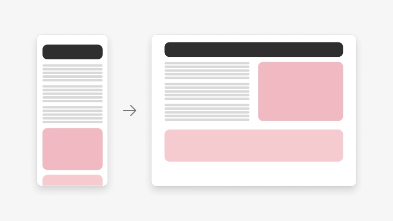
Resize
Adjust the size and margins of page elements
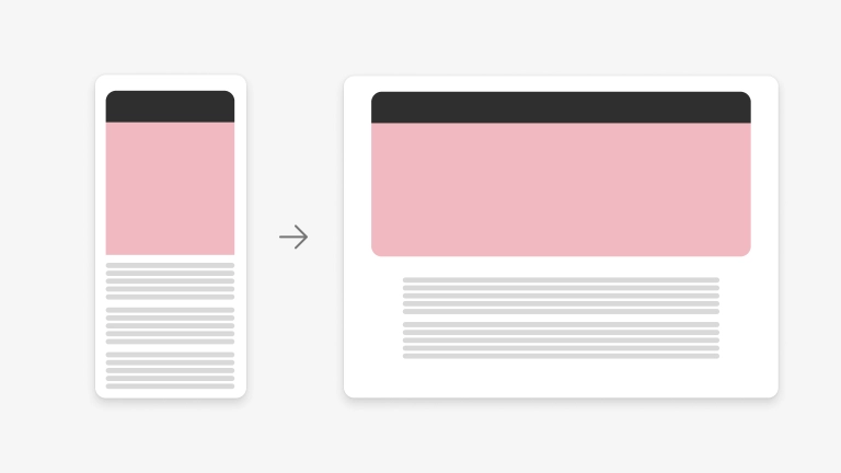
Resize page elements to optimize for a rich user experience by displaying more content at the top of the window and reduce vertical scrolling. Adjust page margins to add white space and balance to the composition. This allows the content to breathe resulting in a more visually appealing design. For example, a hero component can stretch to the full width of the window to show more of the background image. Content underneath the photo can also stretch to show more but uses different margins to add variety in the composition and helps to define visual hierarchy.
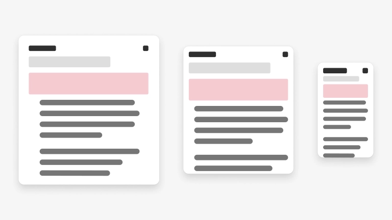
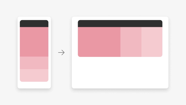
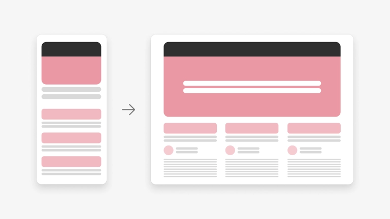
Reflow
Optimize the flow of page elements
Reflow optimizes page elements so they can be fully rendered considering the window size and its orientation by rearranging the content. For example, a single column of content in a smaller window can be reflowed on a larger window to display two columns of text. This allows more content to be displayed “above the fold.”
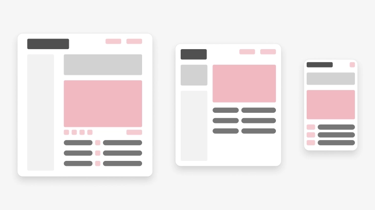
Show/hide
Optimize content for the window size and its orientation
Show or hide page elements to optimize content for the window size and its orientation. This responsive technique gives users the right amount of information and optimal user experience based on how they are viewing it. For example, categories appearing on a small screen show limited meta data like an image, title, and link so more of them can be seen and help the user focus. On a larger screen, categories can show additional meta data like a persona, date, and short description and can still be seen in the view port.
Re-architect
Fork or collapse page elements and content to retain focus on important info and actions.
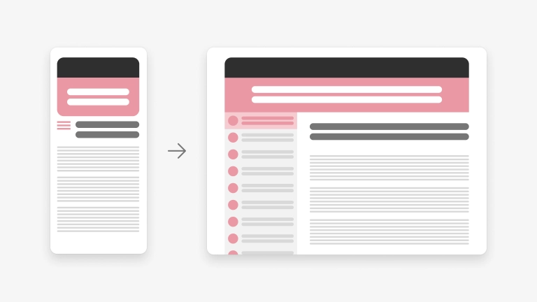
This is similar to following the practice of “progressive disclosure” in your design but for different window sizes and orientation. In this example, expanding the window allows a list of items to be displayed next to the details which helps to visually link the content and let the user easily choose another item. On the smaller screen, focus remains on displaying key info.